HOME & GARDEN

Friday, January 28, 2011

Bathroom Before and After Project

A few months ago, I worked on a bathroom re-design for a client.  I have worked with them for 12 years and I patiently waited to revive this room!  It was screaming "help update me!".

The before:  These fish are going, going, gone! The look was fine for my 20 year old client when she was little, but now it was time to add more space and create a style that represented her (while also keeping in mind the style of the home and that they were going to sell the house some time soon).


The list wish list they asked me to work from:

Keep the mirror and lighting   -  Create more storage that can hold boxes, towels, and photos  -  Change the floor tiles  -  Crisp simple lines  -  Oval sink (I suggested an under the counter sink)  -  New fixtures   -  New Counter top  -  New wall accessories  -  Use of blue in the design with a fun touch  -  Shaker style doors WITHOUT mitered corners  -  Keep it within their budget (I knew I would be able to come in under budget with my creative shopping)

After our consultation, I went home drafted a new design that took care of everything on their list.
Working off of my drawing, solid maple cabinets were custom created and painted  by my cabinetry maker.  Soon after the installation, my client added blue glass knobs that she found. What fun and so easy to change for a new look down the road.   The granite is a remnant from my granite supplier.  This really helped stretch the budget.
Another view of the before.  Look at all of the wasted space in that corner!  This is where I created an open floor to ceiling shelf.  At moms request,  I did have to talk her daughter into letting me change the sink.  The compromise.... it was put in storage for her.

This dark photo does not do the room justice.  I wish you could see that the black granite had touches of steel gray/blue that worked beautifully with the wall color.


The old bathroom floor and toilet before they got ripped out by the contractor.


The new ceramic floor that cost less than $1.00 per square foot.

You can also see a glimpse of the new toilet.  I selected the color bisque for that and the sink.  I forgot to mention  I had to work around a camel colored shower stall that guided me in the floor and fixture selection.  You can see a wee little bit of the shower stall next to the blue wall on the right. 

Monday, January 17, 2011

Thinking about Summer in the Winter

 While going through photos, looking for pictures of my old iris garden, I came across these.  Ahhhhh I can almost feel the warm breeze coming off of the water.  I thought I would share since many of us are surrounded by a foot or more of snow.  I don't know about you, but I am already dreaming of wearing dresses with strappy sandals and not boots and mittens.   

All of the photos are gardens behind the historic House Of Seven Gables in Salem, MA. 


Tuesday, January 11, 2011

Colors For Spring 2011


Do you want to know what colors are hot for Spring for both men and women?  A wonderful mix of both warm and cool colors, Pantone has released their Spring 2011 color collection . Colors for both men and women are fairly similar with a few masculine modifications.   The top color for the year is honeysuckle. 


Fashion colors for women 2011
                                                                  

   Fashion colors for men 2011


If you feel a color is too light or too dark you can play with the lighter and darker versions.

Flirtatious Honeysuckle is a feel-good hue that brings a festive sense of playfulness to this season’s palette. This vibrant pinkish-red for both apparel and cosmetics makes consumers feel alive, and is a perfect post-winter pick-me-up.

Spicy, gregarious and persuasive describe Coral Rose, a sophisticated orange that, much like Beeswax, a warm, honeyed yellow, conjures up feelings of faraway lands and locales. Pair either of these piquant hues with a cool, refreshing color-wheel opposite like Regatta for a vibrant color combination that will add zest to any wardrobe. Romantic, fanciful Lavender implies sensuality with its subtle hint of red undertone. Combine it with Beeswax or Coral Rose for a unique counterpoint.

Alluring Blue Curacao evokes thoughts of tropical destinations and pays homage to the 2010 Color of the Year, Turquoise. Practical consumers can continue to incorporate enticing Caribbean blues into spring by pairing Blue Curacao with warm, complementary colors like Honeysuckle or Coral Rose. Peapod, a fresh yellow-green, brings an organic element to the palette and is reminiscent of the green shoots that signify change and new beginnings traditionally found in spring.

Trans-seasonal neutrals ground this season’s palette and provide a stable backdrop for all the other colors. The so-called “nude hues” are represented in the range of ethereal Silver Peony to dramatically deep Russet. Another dependable background color, Silver Cloud, is the quintessential neutral that consumers can rely on to coordinate with everything in their closet.” 

Source: Pantone, Inc.


Sunday, January 9, 2011

Blue & Brown Bedroom

Here is a before and after project I would love to share with you.  

When I first walked into this room, the walls were a beautiful butter yellow with sheer window treatments.  The first thing I noted was that the soft and filmy window treatments did not balance the weight of the new heavy furniture, that was recently purchased.  I took out my measuring tape, pad and pencil and started to design some full-length window treatments using beautiful silk fabrics and trims.    

This photo is the after photo, but I wanted you to see the finished room first. 


Here is the before photo
Boy did I have plans for this wall over the bed! 


 This sitting area is soon going to be cozy and relaxing


 The pillows above are from the ready-made bedding ensemble that I worked off of for the wall color and selecting the complementary fabrics and trims.


Voila!  A  completely different room

 Told ya I had plans for over the bed!


To see more of my work and work of other designers, you can check out my web site.New England Fine Living.com

Wednesday, January 5, 2011

Valentines Day Ideas

I know it is more than a month away, but if you want your Valentines day a little extra special, then I found a few ideas  for you from some very creative people.

I just had to share this photo I found on Universal Scraps.com.  Wow!  I am not recommending you bedazzle your lips, but you would certainly catch his attention.


Now this Valentines idea is a lot easier than the lips with crystals.  Red Valentines hearts on your tea bags with a little message written with a white pen.

Photo From Martha Steward

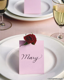
 Okay, so you should know each others name and where to sit, but I just loved the look of the pink table card with the deep red rose.
Photo from Martha Stewart
 Red Tulips surrounded by red hots.  Ahhh the smell must be heavenly.
Photo From Martha Stewart
 How about a larger dinner party for a few of your favorite couples or just a group of friends. 
Photo of work by Preston Bailey
 For more ideas and inspiration, please visit my web site. New England Fine Living.com

Tuesday, January 4, 2011

Truck Theme Birthday/Corporate/Christmas Party


I know I am a little late putting up these photos, but I needed to focus on a few parties and design clients and this post got pushed onto the back burner.

The event, these unique trucks were created for, was a very special 90th birthday party.  The birthday boy founded a waste management company, hence the truck theme, and since it was near Christmas, I made the trucks look like over-sized ornaments.  I wish I could say I decided to do the sparkle right away, but it was really due to a mishap with the "special" paint I used on the plastic trucks.


Walking out of the toy store with 11 Toy Story trucks was the first fun part of the project.  Once I got them home, I had to remove the little pink bear on the front of the trucks (I ripped him off with pliers... I felt so cruel)  These pink bears talk to you when they are touched, so I has some pretty interesting conversations with them.  I then taped the areas I did not want to paint.  This is when things went wrong.  I primed them with the proper primer and waited the allotted time to paint them again, and the paint started bubbling and cracking.  OMG!  I had to sand them down and tried again.  NOPE. They bubbled and crackled again.  I was beside myself.  Hmmmm what to do?  What to do?  Then I had my "ah ha" moment.  Sparkles.  I was going to start with JUST the back being done in white sparkles, but the blue front looked boring, so I sparkled the front too.  In the photo below, I used glue to put on the sparkles, but when everything dried, I did have holidays, so I went back with blue paint and shook on more of the glitter.


Once the blue was done, I thought now the silver needs some, then of course the red back up lights, then I did the windows with black.  My house, my clothes, my dogs feet, everything had a touch of this magical fairy dust stuck to it.  Since I work on project between going to my store or design jobs, there are times my projects are left out in the open, or I don't have time to clean up.  This was one of those projects, and I literally placed a sign on my front door that said "Warning, glitter zone, enter at your own risk"  :-)  .


For the base, I cut foam boards, then covered them with buffalo snow fastened by floral pins. this was one of two layers.


These were the favors I had created for the party that were placed at each place setting


In the background, the hostess of the birthday party had a dvd created that played on the flat screen tv, and we had shadow boxes created to document her fathers life and how the business started.  


For more party and decorating ideas, please visit my web site New England Fine Living.com or if you have a project you would like to discuss please contact me. E-mail